Tuesday, April 30, 2013

Fung Jeannie: Week 5 Fashion Lenses

Final Render 

Ghosted : Key Shot

Ghosted : Top View

Ghosted: Bird Eye View

Picture Frames

Picture Frame as Background


My inspiration for these glasses were inspired by Jeffrey Campbell. He is a fashion designer that is best known for his exotic shoes. He uses curves in his design a lot. These glasses are suppose to make the users sport a playful appeal. 


Sunglasses Week 5: Jay Gibson

Ghosted 


Ghosted Color

Isometric Sketch
Orthographic Sketch


Rendering 1

Rendering 2
I decided on a simple shield style design for my glasses. The lens is polarized black tint. The outer 
border on the lens is 24kt gold as well as the stripes on the sides. The main frame is a hard gloss black
plastic. The back half of the arms are rubber for comfort and added style/texture.

Javier Rivera Week 5 Proto. ski goggles

Rendered 1

Rendered 2
Rendered 3

                                                     Ghosted for keyshot


                                               Orthographic views
I came up with this ski goggles idea as I saw my roommate working on his graphic design project which consisted on the development of a package for some ski goggles. As we can appreciate on the drawings, this model was intended to have a camera on top, but I had to eliminate it because of my bad time management plus, I spent most of my time figuring out how to create the curve on the goggles so they fit the face properly.

Brad Dunn Week 5 Goggles


The idea behind this design was a simple, utilitarian pair of goggles. They're made of rubber, to be air-tight, if the person using them was to use them for swimming, and the lenses are made of glass, so they could withstand a higher heat than if they were made of transparent plastic. The lenses are also tinted, so the user could use them for welding. Although, I would recommend more protection for that.
I like the aesthetic of a thick pair of goggles. Especially around someone's forehead. Like, the classic aviation goggles look. That was the inspiration behind the minimalistic appearance. 

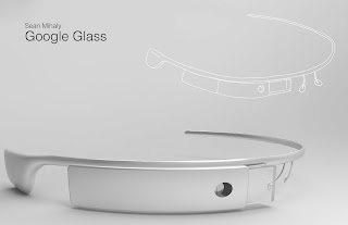
Sean Mihaly Week 5: Google Glass


My inspiration for this model was the Google Glass project. I find the design of the Glass to be unique in its organic form, and I thought it would be a unique challenge in terms of modeling. Google's take on design is very clean, so I tried to approach this similarly, using white and grey as the color (or lack there of) scheme, like the original Glass. I used a unique way to model this, by forming the frame in a straight line, modeling the other components onto it, then using OrientSrf to place the eye wear on a sphere to give it its shape. 

Brantley Everett week 5: Sunglasses


I was inspired to make mono lens sunglasses by the aerodynamic windshield of a car.  I thought the rounded shape of the glasses would let air pass over them better than conventional sunglasses. I made these to be used while skiing, cycling, or any other sport where you would be moving very fast. I made the the lens out of UV resistant orange plastic, so they wouldn't shatter if dropped. I chose orange because it blocks out blue light, making it easier to see changes in terrain in foggy and normal conditions.

Shreya Mehta: Week6 Sunglasses

This week I modeled sunglasses form original sketches. I wanted to design a pair of everyday glasses. That way who ever bought them could toss them in a purse or a back pack without having to worry about ruining them. For my materials I chose a carbon fiber for the frame and arm bands. This way when it is rolling around a bag it will be strong enough to where it will not bend. I also added a mini titanium frame around the glass lessens to make it stronger and less prone to getting chipped or shattered. I used the same polished titanium for the hinges connecting the arm bands to the main frame. I like the titanium because It adds a little bit of shine to the product yet with a subtlety. 
When modeling these sunglasses in rhino I began with my orthographic drawings. I drew a curve of my main frame in the front view then used curve to view to a curve I had drawn from my top view. I made the lenses the same way. Wheat I really had issues with was the arm bands because they had some interesting bends in them. I used a two rail sweeps for the left and right sides of each and then blended the two surfaces together. I ended up with a lot of kinks and naked edges in them. When I go back to fix them I will re draw the arm band curves then rebuild them to get rid of the kinks. 
Over all I really enjoyed this project and I like the final product I came out with. These sunglasses are glasses I would defiantly wear. 
Orthographic Sketches

Isometric Sketches
Rendering with Orthographic sketches

Rendering with isometric drawing 
Hinge Detail
Ghosted view sections ready for key shot
Ghosted view with Picture frames in background
Black Ghosted View with Naked Edge 


Bamidele Elegbede : Week 5 Eyewear Design

GLASS PRO


Ghosted View
KeyShot material application Layers. 
Final KeyShot Render


     The GLASS PRO concept is a wireless viewfinder for your camera and other compatible devices. The concept was initially designed for photographers but could be adopted by many other professions and hobbyist.

I modeled the headrest first using 2 rail sweep then filleted the edges. Then the headphone/mount.     After that I modeled the eye patch by creating a spear and projected a curve onto it. The projected curve was then lofted to a circle. The circle was then extruded to create a base for the viewfinders arm. The arm was first sketched on a flat plane using a interpolate curve and then rotated to its correct position. The curve then got duplicated and I did a 2 rail sweep. I used project, extrude and boolean difference to make curves on the surface of the headrest and viewfinder arm. Finally the pad was made from a rebuilt sphere. 

I choose this form for Glass Pro because it looked simple, modern and could be easily customized to fit perfectly.