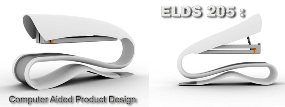
For my USB design I went with a almost comical (because of the generic labeling) simplistic look. While designing my USB I thought of many ways to make mine stand out as much as possible. Thats why I gave it the white finish and the obvious gap in the middle, that could be used for looping it around your belt or keys where is most assessable.
I designed my USB in this simplistic fashion to really remind you what it is. On the market today there are so many crazy little USB's but why? how many people could possibly comment on a USB for you to spend 30$ on it. So my Design is built for function not fashion.


No comments:
Post a Comment
Note: Only a member of this blog may post a comment.