Showing posts with label Ruan. Show all posts

Thursday, May 29, 2014

Ruan Basson: ELDS 205 Final: Kite


My kite was inspired by the Orca whale.  I felt that since it is going to be a large object in the sky, it could represent a large animal.  I chose the Orca because I like their black and white color.  It was relatively easy to make and I enjoyed making it too.  I would not use packing tape next time, however, because it was not as sticky as I hoped it would be.  I can't wait to make another.  It was also fun to fly it at Tybee.  I was afraid the loose tape would make the whole thing fall apart, but to my surprise, she took right to the sky and stayed there.  At one point near the end of her flight, she came undone, yet she still stayed airborne.  This just goes to show how forgiving the Delta kite design is.  After a quick repair she was up and flying again until I brought her back down to pack up.

Thank you for a great quarter and I wish you all the best.  Great ending to a great class!

Tuesday, May 20, 2014

Ruan Basson: Week 8 Lamp - OVO

Original form

sliced form


The inspiration for my lamp lies with modern design.  I love sleek, flowing design, so I tried to incorporate that into my lamp.  It is also an iteration of my ring that I had printed.  
I used a very simple method to create the form of the lamp.  I first made a torus, tapered it, and trimmed the bottom of it so it could sit on a table.  I then put a point in the center of the form and radiated the cross sections from that and used the pipe method to get the cutouts.
I rendered it in black plastic because I wanted to see what the finished product would look like.  I love a black and white palette, so other iterations could be white and a transparent acrylic.

Thursday, May 8, 2014

Simple Statement - Ruan Basson: Week 6 Ring

 Ghosted view

 Front 3/4

Rear 3/4

Close Up


For this project I wanted to make a ring that I eventually print in silver with Shapeways.  I plan on making it a mother's day gift for my mom.  The tanzanite in the center I bought a few weeks ago and I have also bought the 1mm accent diamonds.  When I do get to printing this in silver I will set those stones in the halo and basket setting.

I used a lot of solid building and filleting to get the finished product.  I also use project to extrude and trim the cutouts before I filleted them.  That is where my issues came in.  When I filleted the edges of the cutouts, I did not notice at first that there was a surface issue, so I could not fix it right away.  When I later noticed them and tried to go back to remove them, all methods I tried failed.  I plan on remodeling the top portion, as I have saved an earlier iteration of the model.  The stones I did not model myself, I had a friend in the CAD class for jewelry give me the prebuilt stone file her professor provided them, since the important portion of my model is the setting for the stone.  I needed to be as accurate as I could.

The material is sterling silver, since that is what I plan on printing it in this material eventually.  I like the look of silver, since it is a warmer looking metal than platinum or white gold.  The tanzanite resembles the one I have as closely as I could get it.  The diamonds are also almost exactly the way they look in real life.  I played with the material settings to achieve this, and I love the way the model turned out. 

Thursday, May 1, 2014

Ruan Basson Week 5: Hand Glass Sunglasses


Ghosted Image Hand Glass

Bottom Front 3/4 Hand Glass

POV Hand Glass

Bottom Rear 3/4 Hand Glass


Jennifer Lopez in Hand Glass

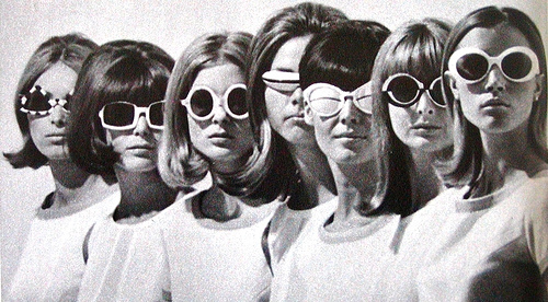
My inspiration for these sunglasses lie in many places.  The lens shape from none other than Tom Ford.  I like the look of odd sunglasses, so I took inspiration from Chanel and Prada for the shape.  The time period I took design cues from would definitely be the 1960s.  I decided to make them a pair of hands that seem like they are presenting something precious for the wearer to look through.  I enjoyed the designing process, since these sunglasses are not what you typically see walking down the street.

I used several basic modeling techniques to get the final form.  For the lens I simply built off of a circle.  I made the loft curves in the side and top windows and lofted the dome shape.  The frames are an extruded polycurve that I split in half and then mirrored before rejoining to make them symmetrical.  All the edges where either chamfered or filleted.  I then used offset surface with solid selected to finish the one and mirror it to copy it.  The hands are a combination of piped curves and booleaned ellipsoids.  I would draw the curve in side view and then transform them to look like I wanted.  I then piped them and filleted the fingertips.  The ear hooks are also an extruded polycurve.  I then used boolean union to join all the solids.

When I rendered these I chose to go the practical route.  I chose black plastic for the hands because I want them to look almost silhouette-esque.  I chose a stark contrast form the frame color for that sole reason, I wanted contrast to emphasize the look that the hands are "presenting" them for the wearer.  The lens are orange because that color is bright and fits with the 1960s palette.  I added J-Lo as a model to show scale and give a better impression of the final product.

Tuesday, April 22, 2014

Ruan Basson: Week 4 Detergent Bottle

 Ghosted view
 Birds Eye View
Ant View

I wanted to design a bottle that was beautiful.  Simple as that.  I want the user to be able to feel comfortable leaving it out in the open without feeling embarrassed or self conscious about the look of their product.  This was the idea behind the Haute Deto Bottle.  I kept lines minimal and purposeful.  They flowed with the form and gave a sensual aesthetic to the bottle as a whole.  Haute Deto is the perfect luxury detergent bottle.

I used the loft command over curves I drew to get the overall form.  I then used a series of curve projections to get the "sliced" cap, the body curves, and eventually to separate the lid from the body of the bottle.  I then used the Offset Surface command to get the clear indentation.  Sweep 2 took car of the concave curves.  There were some problems with this method because they made it difficult to fillet and made a few naked edges.  I used the Join Naked Edges Command to try and get rid of them, however there are still some small leftover edges in this region.  All methods that I am familiar with could not help me join the edges, as small as they all are  I then used the Offset Surface command to get the thickness of the bottle.  I tried to get liquid on the interior using boolean difference, but it somehow looks odd in the rendering.

I chose plastics as the material, to show what the bottle might actually look like after manufacturing.  I like the minimal color scheme of black and transparent as they will fit with any household decor and still stand out beautifully.  The liquid inside is just a painted color, but does not show through the plastic section very well

Thursday, April 10, 2014

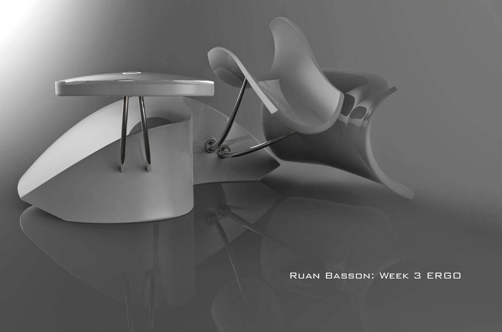
Ruan Basson: Week 3 ERGO

Ghosted

Elevated 3/4

Elevated 3/4 (opposite)

Ant View 3/4

The inspiration for this mouse lies in ergonomics.  I used this keyboard as a jumping board to figure the function of the mouse and how I wanted the user to interact with it.  I also wanted to keep a sleek and sinuous form while maintaining my minimalist aesthetic.  The pointer finger and thumb rests are actually the left and right mouse buttons.  To click one simply pushes down on the rest.  The elevated pad with the lighted rings is a capacitive touch screen to scroll and pan with the middle finger.  This rest is stationary and does not move.  To click one would simply tap twice and hold their finger on the pad the second time. I really enjoyed modeling this mouse.  

I used a lot of piping for the forms.  The forefinger and thumb are piped, then I projected a curve to cut them, scaled and copied the form and used Sweep2 to connect them (after making connecting segments).  The body was done the same way as in class, but I projected a curve to cut the shape to its final form.  The only edges I could not figure out how to fillet were the ones at the rear of the forefinger and thumb rests.

The materials I used were white plastic, titanium, and glass for the capacitive touch pad.  The forefinger and thumb rests are a soft plastic to add comfort.  I felt that the materials should be close to what they would be if the product was actually produced.  I feel this would also make it more affordable too. 

Tuesday, April 8, 2014

Ruan Basson: Week 2 Flashlight

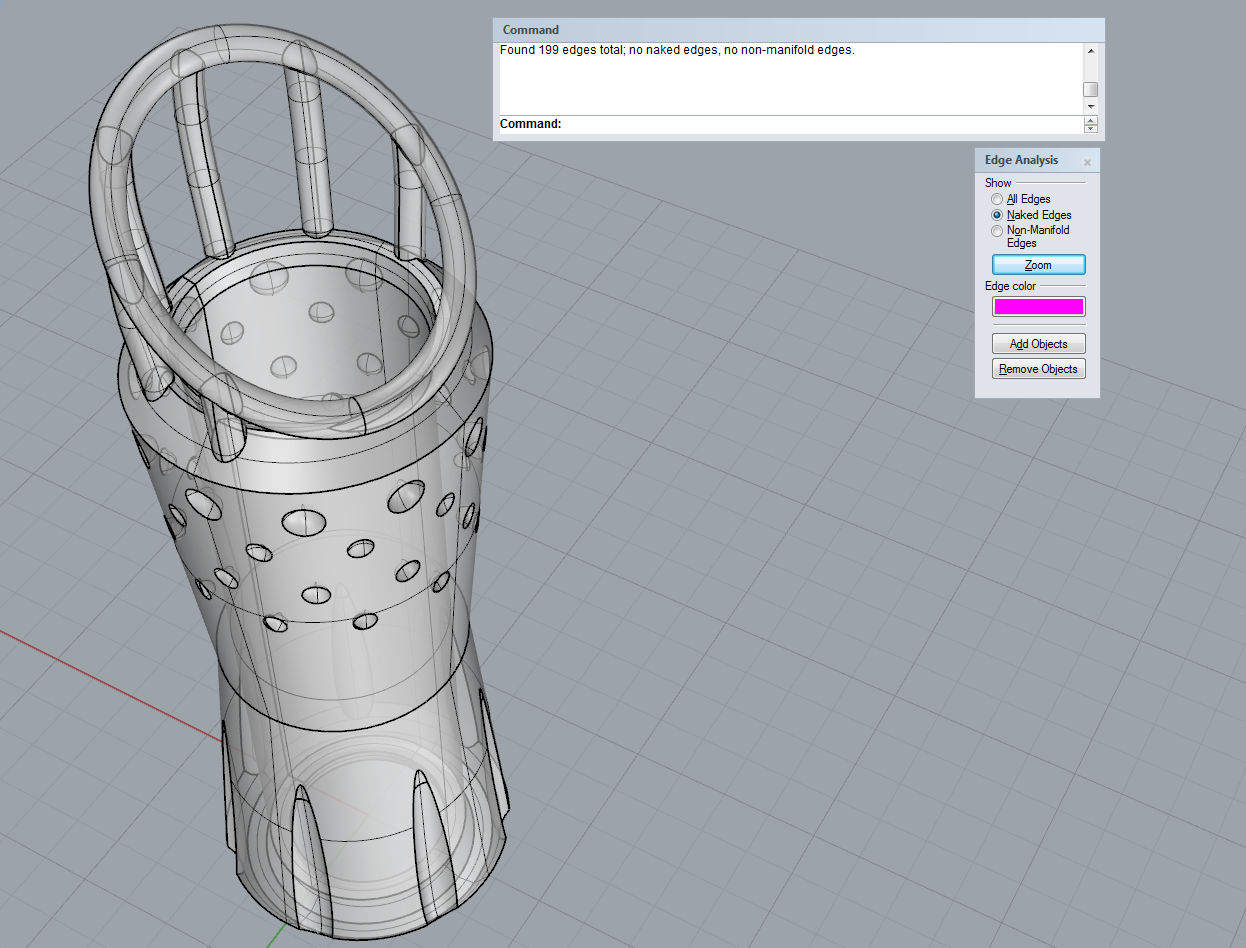
First Attempt
Ghosted View of Orbitus (Final)

Profile View

Elevated 3/4 View

Shapeways Profile

My goal for this sleeve was to see how far I could push the profile without breaking the bounding lines.  Initially I planed on making a sort of bird's nest around the light, but I ran into difficulty creating solid forms without naked edges.  That is when I moved to Orbitus.  It retains elements of the original, but with more achievable forms.  I am pleased with the result of the new sleeve, but given the choice I will try to ready the previous model for printing.

I used the Revolve tool to get the sleeve shape from the original curve drawing with chamfered edges.  The Boolean Difference too came in hand to get all the cutouts.  For the top ring, I revolved the boundary box for the sleeve and projected a curve across it, and finally used the Pipe command.  I drew curves and used the Array Polar command to get the columns and then piped them as well.  It took a while to go in and trim all the intersections to join them, (I realized too late that the Boolean Union tool negates all these superfluous steps).  

The materials for the sleeve are all what you could get from 3D printing, with he exception of the transparent top portion.  I would like that to be either a transparent or translucent plastic, but for illustrative purposes I have used glass in the rendering.  The idea is that the light emitting from the flashlight will catch in the transparent/translucent plastic and illuminate it, giving a really interesting effect.  I am a huge fan of minimalism, and so Black, White and Transparent fit in nicely to that aesthetic.  I enjoyed the process and can easily see myself doing it again.

Tuesday, April 1, 2014

Ruan Basson: Week 1 Castle

 Pedestrian View
Bird's Eye View
Ghosted View

The inspiration for this castle came in three parts.  One was the castle Prof. Scott designed in class, the next is the Hagia Sophia in Turkey, and the final inspiration stemming from the design of the city of Asgard in the movie Thor.  I liked the permanence that the two latter structures gave, so I tried to convey the same in my castle.  It is bottom heavy to provide the illusion of stability and it is also very large (in concept) to further purvey that feeling.  

To model the castle, I used mostly the 'Solid Building' tools.  the exceptions being the cutouts, which use the Boolean Difference tool, and the supports, which use the Extrude to Point tool.  For all of these I used a combination of the handled curves and linear segments.  Another tool I found extremely useful is the Polar Array command.  This saved me a lot of time and irritation by doing most of the work.  I also learned about the Gumball tool from the Lynda.com videos, and this helped a lot with moving and duplicating objects (holding the Alt key while moving).  

The materials I used represent me as a jewelry designer, while the construction itself represents my love of Industrial Design.  The outer wall is aquamarine, the 'nests' are diamond. I used anodized aluminum for the main structure and gold and silver for the turrets/minarets.  I made the large orbiting toruses light elements, because of my love of lighting design.