Showing posts with label ELDS 205. Show all posts

Monday, May 26, 2014

Ellen Siu: Week 9_Chair Design

Ghosted Image in Rhino
Rendering 1
 Rendering2
 Rendering3
 Rendering4


My tubular chair design was based on the curves, I want to modeling a simplify, cool shape which would comfortable to sit in and create a chair that is unique, it is better if that is convenient to be stacked.

To create this chair on Rhino, I started out with a curve. I adjust its curvature and use lots of 'Pipe' to transformed the curve that looked more smoothly and awesome. I used also 'Offset' to built up a basic form for the back of the chair, and used 'Boolean Union' to constitute the main shape of my chair.

For the materials, I love to sitting on wooden chair, such as bamboo as it's a great material which can reduce the heat influence of human body to the chair. So I designed three chair style in this project. In the end, the red one is my favorite as it can assist the chair to be more outstanding; A smoothly glossy red and sliver steel.

Thursday, May 8, 2014

Billy Nisbet: Week 5 Ring


My inspiration for the Hexaring was the honeycomb shape. I experimented with several different forms to incorporate the shape, and decided upon the chain resting halfway in the surface of a traditional ring. I designed this ring to be unisex, it can be customized through material choices.

To create this final design i used sweep 1 to create the traditional ring shape.  By working out the total circumference, I calculated the appropriate sized hexagon to form a seamless loop around. I piped and filleted to get my final shape refined.

Materiality in the two rings consists of an inner ring of ceramic, and the hexagonal ring composed of precious metals. The precious metals shown are platinum on top, gold on bottom.

Tuesday, May 6, 2014

Billy Nisbet: Week 5 Sunglasses


 The inspiration for the RAY-RAY'S sunglasses was to emit more "rays" around the edges of the frame. By changing proportions of the frame and changing its materiality, I was seeking to make ray-ban-like sunglasses that could emit more light around the edge of the frame, making it both visually lighter, and lighter in weight.

The processes i used most to produce these forms were control point curves to clean up my orthographic drawings. Control points on was helpful in refining such lines. Curve from 2 views is a very powerful tool and was very helpful in creating the frame. For the lenses I created a large sphere and placed it at the correct angle to be a lens, I then split the sphere by the frame and deleted the extraneous surfaces. Boolean processes and filleting were used to clean up final shapes.

For materials I used a dark plastic for the sunglasses arms, and a grey-shaded front-frame. The lighter frame on the front is meant to emit a little more light than a traditional pair, so a beautiful day does not just appear overcast while wearing them.

Thursday, May 1, 2014

Ruan Basson Week 5: Hand Glass Sunglasses


Ghosted Image Hand Glass

Bottom Front 3/4 Hand Glass

POV Hand Glass

Bottom Rear 3/4 Hand Glass


Jennifer Lopez in Hand Glass

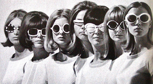
My inspiration for these sunglasses lie in many places.  The lens shape from none other than Tom Ford.  I like the look of odd sunglasses, so I took inspiration from Chanel and Prada for the shape.  The time period I took design cues from would definitely be the 1960s.  I decided to make them a pair of hands that seem like they are presenting something precious for the wearer to look through.  I enjoyed the designing process, since these sunglasses are not what you typically see walking down the street.

I used several basic modeling techniques to get the final form.  For the lens I simply built off of a circle.  I made the loft curves in the side and top windows and lofted the dome shape.  The frames are an extruded polycurve that I split in half and then mirrored before rejoining to make them symmetrical.  All the edges where either chamfered or filleted.  I then used offset surface with solid selected to finish the one and mirror it to copy it.  The hands are a combination of piped curves and booleaned ellipsoids.  I would draw the curve in side view and then transform them to look like I wanted.  I then piped them and filleted the fingertips.  The ear hooks are also an extruded polycurve.  I then used boolean union to join all the solids.

When I rendered these I chose to go the practical route.  I chose black plastic for the hands because I want them to look almost silhouette-esque.  I chose a stark contrast form the frame color for that sole reason, I wanted contrast to emphasize the look that the hands are "presenting" them for the wearer.  The lens are orange because that color is bright and fits with the 1960s palette.  I added J-Lo as a model to show scale and give a better impression of the final product.

Wednesday, April 23, 2014

Reed Herne: Week 4 Detergent Bottle


In designing this project my goal was to create a slightly refined design that did not stray far from the typical consumer detergent bottle that might be found on the shelf at a store. I extended the bottle with an extra chamber extruding from the top and an elongated tip for facilitate pouring. The cap has ridged along the sides allowing grip so that the cap can be easily twisted off if too tight. 

For the basic shape of the bottle I used a sweep 2 command and planar curves for the ends. To create the depression on the bottom surface of the bottle I used the split, scale and loft tools. For the handle I used primarily the extrude curve and fillet tools. Along with the fillet tool I also used the create pipe command to create smooth transitions between surfaces. As for the cap and tip I used the helix, sweep 1 and boolean union commands. To give my bottle structure I used the offset surface command; creating the walls of the form. I found that the DIR (direction) command was practical when troubleshooting boolean operations. 

My material choices were typical much like the shape of my bottle. I chose plastics for cost efficiency since detergent bottles are mass produced, and the colors of the Tide brand bottle because it is easier for the consumer to identify a product they are already familiar with. The transparent cap allows for easier analysis when grading.

(Scott- I emailed you regarding the renderings, I did not have a full version of Keyshot to use while back in DC so I used the demo, hence the watermarks and size)

Thursday, April 10, 2014

Ruan Basson: Week 3 ERGO

Ghosted

Elevated 3/4

Elevated 3/4 (opposite)

Ant View 3/4

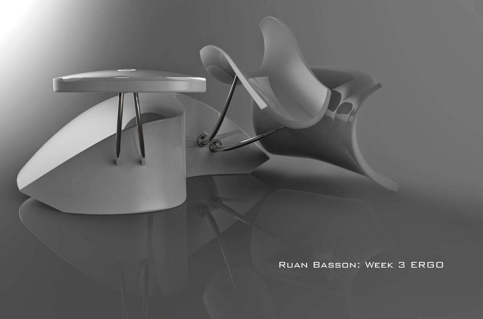
The inspiration for this mouse lies in ergonomics.  I used this keyboard as a jumping board to figure the function of the mouse and how I wanted the user to interact with it.  I also wanted to keep a sleek and sinuous form while maintaining my minimalist aesthetic.  The pointer finger and thumb rests are actually the left and right mouse buttons.  To click one simply pushes down on the rest.  The elevated pad with the lighted rings is a capacitive touch screen to scroll and pan with the middle finger.  This rest is stationary and does not move.  To click one would simply tap twice and hold their finger on the pad the second time. I really enjoyed modeling this mouse.  

I used a lot of piping for the forms.  The forefinger and thumb are piped, then I projected a curve to cut them, scaled and copied the form and used Sweep2 to connect them (after making connecting segments).  The body was done the same way as in class, but I projected a curve to cut the shape to its final form.  The only edges I could not figure out how to fillet were the ones at the rear of the forefinger and thumb rests.

The materials I used were white plastic, titanium, and glass for the capacitive touch pad.  The forefinger and thumb rests are a soft plastic to add comfort.  I felt that the materials should be close to what they would be if the product was actually produced.  I feel this would also make it more affordable too. 

Tuesday, April 1, 2014

Ruan Basson: Week 1 Castle

 Pedestrian View
Bird's Eye View
Ghosted View

The inspiration for this castle came in three parts.  One was the castle Prof. Scott designed in class, the next is the Hagia Sophia in Turkey, and the final inspiration stemming from the design of the city of Asgard in the movie Thor.  I liked the permanence that the two latter structures gave, so I tried to convey the same in my castle.  It is bottom heavy to provide the illusion of stability and it is also very large (in concept) to further purvey that feeling.  

To model the castle, I used mostly the 'Solid Building' tools.  the exceptions being the cutouts, which use the Boolean Difference tool, and the supports, which use the Extrude to Point tool.  For all of these I used a combination of the handled curves and linear segments.  Another tool I found extremely useful is the Polar Array command.  This saved me a lot of time and irritation by doing most of the work.  I also learned about the Gumball tool from the Lynda.com videos, and this helped a lot with moving and duplicating objects (holding the Alt key while moving).  

The materials I used represent me as a jewelry designer, while the construction itself represents my love of Industrial Design.  The outer wall is aquamarine, the 'nests' are diamond. I used anodized aluminum for the main structure and gold and silver for the turrets/minarets.  I made the large orbiting toruses light elements, because of my love of lighting design.

Thursday, November 21, 2013

Christian McKenzie - Week 10: Laserscan


For this project I bought a cheap vinyl toy. I pulled it's head off for the scan. I thought it would be fun to model it into a  direct knock of a Kidrobot designer vinyl Dunny. http://www.kidrobot.com/  So i did and I named it Dummy. Laser scanning, I partnered with Mathew Grello.

I did an 8 veiw 360 scan of the object, then i did a bracket scan for a hole that wrapped around, then a did a single shot scan for a smaller hole. I then did an auto trim on the scans and aligned them. then i fused them. I then brought them into rapid works and ran a mesh repair wizard and filled any tiny holes that left in the mesh. Since the model wasn't very lumpy, but polished up anyway. I then used the solidify with a relaxed mesh and exported the model.

I traced the contour of the knob on the top that is used to hold on a head. and booleaned the model and the revolved surface together. I rebuilt and altered the controlpoints on a sphere to make the head and the ears, bolleaned them together and filleted the seam.

Tuesday, November 19, 2013

Eris Muller: Week 10 Genori Shoe


         My first design was where the heal had a piece of material that wrapped around it but  decided it would be better if I added a buckle to the shoe. The cut outs in the shoe add a classic yet fun flare. I didn't want to have a straight down since that is very typical of high heals so I sliced through the wedge. I incorporated the name of the shoe into the sole using pipes.
        The materials I used were red velvet and brown leather for the top, brown and black cloth for the inner liner and buckle is made out of nickel. I choose red because red serves as a neutral for a lot of outfits, and of course brown can go with most anything.
        The tools that were most used in the process of making my shoe were curve to view, split, project, trim, sweep 1 and 2 and extrude surface.

Monday, November 11, 2013

Christian McKenzie - Week 8: Chair


Entente is defined as a friendly informal alliance between to social parties. The name seemed appropriate, I couldn't think of something more friendly then the agreement between my ass and a chair and there are those asses that seem quite stately(pun intended). I was initially draw to a bell form for the legs, it evolved naturally from there. I imagine this chair in the waiting area of an office. With the office in mind, I made the base of the frame flat laterally for the ease of aligning multiple chairs in rows.
I drew my initial inspiration for my logo from the Volkswagen logo (http://www.vw.com/en.html).

Modeling I drew the curves, tubed them, extracted the isocurves, trimmed and then used blend surface. I made a Y joint where the back and the legs meet. I made the cushions by using the planar curve command, rebuilt the surface, adjusted the control points, then used the bend tool to make the cradling contour of the cushions.
 For my logo, I used the same process, but instead of bend I used the cage editing tool in the transform menu.

Materials I chose leather and anodized chrome. I feel that is frequently desired in offices. It is easily cleaned and it is durable. 

Friday, November 1, 2013

Avi Spratt Week 7: Parabellum Wooden Lamp

When I'm home, I go target shooting fairly often. I've always thought that a rifle cartridge would be a really cool shape for a lamp fixture. I started first by making the three dimensional model using tube extrusions and a truncated cone. I then used the contour command to create the waffle construction. I then extruded the curves to .25 because my material is 1/4" ply. For modelling materials I used a heavy grain, unfinished wood, and a point light defuse bulb.


Lit, with perspective drawing

Off, with cut sheet
Lights on

Lights off